
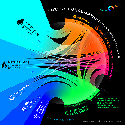
Infographic illustration charting the flow of energy in the USA from energy source to end user. Listed at left are the main forms of energy available in the US (petroleum, natural gas, renewable sources, coal, nuclear). The coloured pathways indicate the main end users (far right) for the fuel source. Units are measured in quadrillion BTUs (British Thermal Units). The chart also shows how much energy is wasted converting raw sources into electricity (65& loss). Data based on 2020 figures by the US Energy Information Administration.
| px | px | dpi | = | cm | x | cm | = | MB |
Details
Creative#:
TPG33842884
Source:
達志影像
Authorization Type:
RF
Release Information:
須由TPG 完整授權
Model Release:
n/a
Property Release:
n/a
Right to Privacy:
No
Same folder images:
illustrationartworkcgidigitally-generatednobodyno-onetextdatavisualizationvisualisationdatainfographicinfographicalchartgraphmapcircularradialsankeyenergyconsumptionfuelfossilfuelrenewableenergynuclearcoalpetroleumnaturalgasdomesticenergyindustrialenergyzero-emissionbtubritishthermalunitususaunitedstatesamericaamerican
americaamericanartworkbritishbtucgichartcircularcoalconsumptiondatadatadigitally-generateddomesticenergyenergyenergyenergyfossilfuelfuelgasgraphillustrationindustrialinfographicinfographicalmapnaturalno-onenobodynuclearpetroleumradialrenewablesankeystatestextthermalunitunitedususavisualisationvisualizationzero-emission
 Loading